
Aligning a legacy experience with a modern design system.
Role: Lead Product Designer | Tools: Adobe XD, Axure, Figma, Mural | Team: 2 UX Designers, 3 UI Developers, 1 Lead Accessibility Engineer, 3 Accessibility Engineers, 3 Quality Assurance Testers, 1 Business Analyst, 1 Product Owner |
Year: 2023-2025
Year: 2023-2025
The Problem
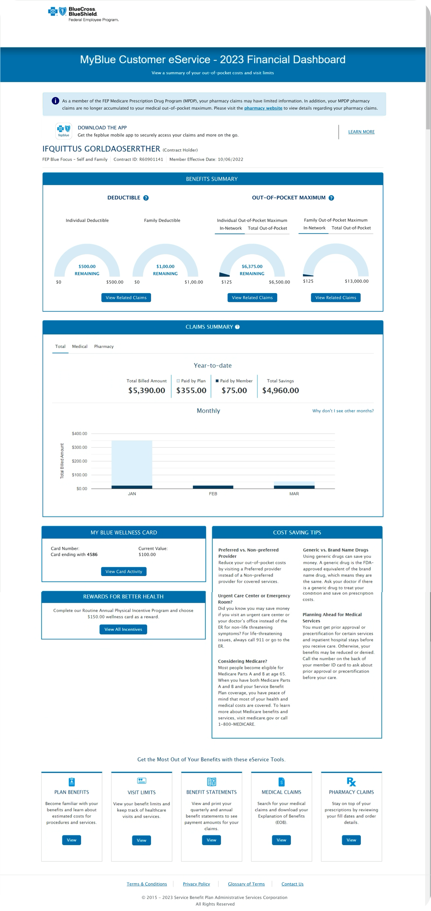
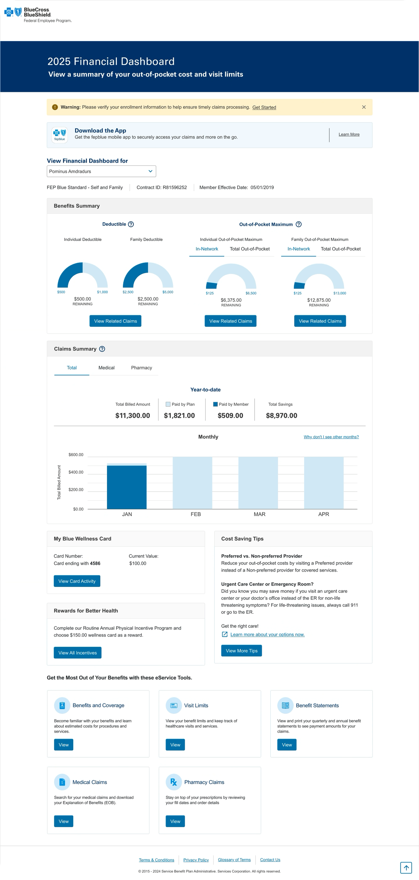
As MyBlue evolved, eService product pages were built by multiple teams using inconsistent UI components, patterns, and accessibility implementations. This fragmentation made the experience harder for members to navigate, increased cognitive load, and created accessibility risks.
To support scalability, accessibility compliance, and a cohesive member experience, MyBlue required a structured approach to aligning existing products with the MyBlue Design System—one that ensured consistency across pages while enabling teams to move forward efficiently.
No Dedicated Resource
As is often the case, the Design System did not have a dedicated team for the customer-facing website. This meant that I had to lead the creation of the new component library in tandem with my product team's work.
My Role and Approach
I was responsible for collaborating with Accessibility Testers, Product Owners, and Developers to ensure that updated components in the test environment matched UX prototypes before being released to the live site. My role involved ensuring that these updates met accessibility requirements, aligned with the MyBlue Design System, and supported scalable adoption across eService product pages.
I was responsible for collaborating with Accessibility Testers, Product Owners, and Developers to ensure that updated components in the test environment matched UX prototypes before being released to the live site. My role involved ensuring that these updates met accessibility requirements, aligned with the MyBlue Design System, and supported scalable adoption across eService product pages.
Partnered with Accessibility Testers to build validation workflows comparing prototypes against the test environment.
Conducted component-level reviews to confirm design system alignment and accessibility compliance.
Collaborated closely with Product and Development teams to resolve discrepancies quickly and effectively.
Documented findings and provided actionable recommendations, helping accelerate page-by-page development while ensuring design fidelity.
Actions
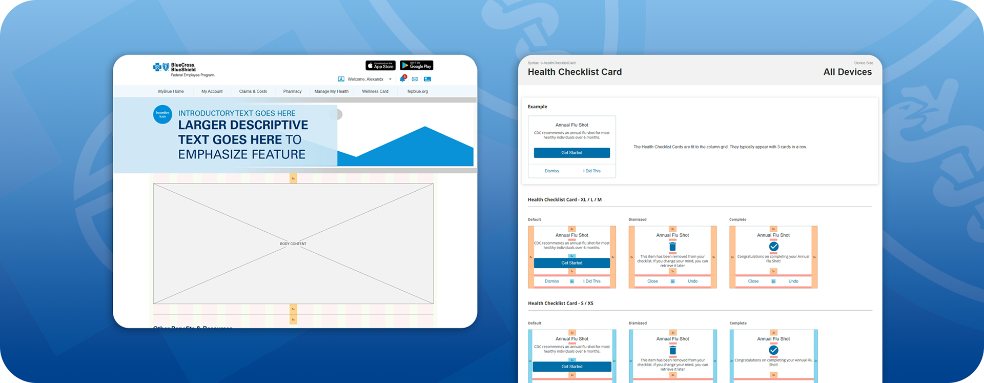
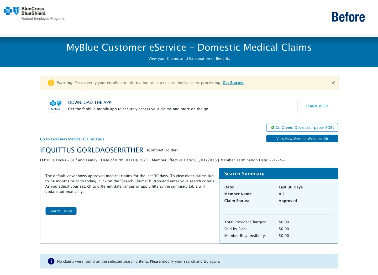
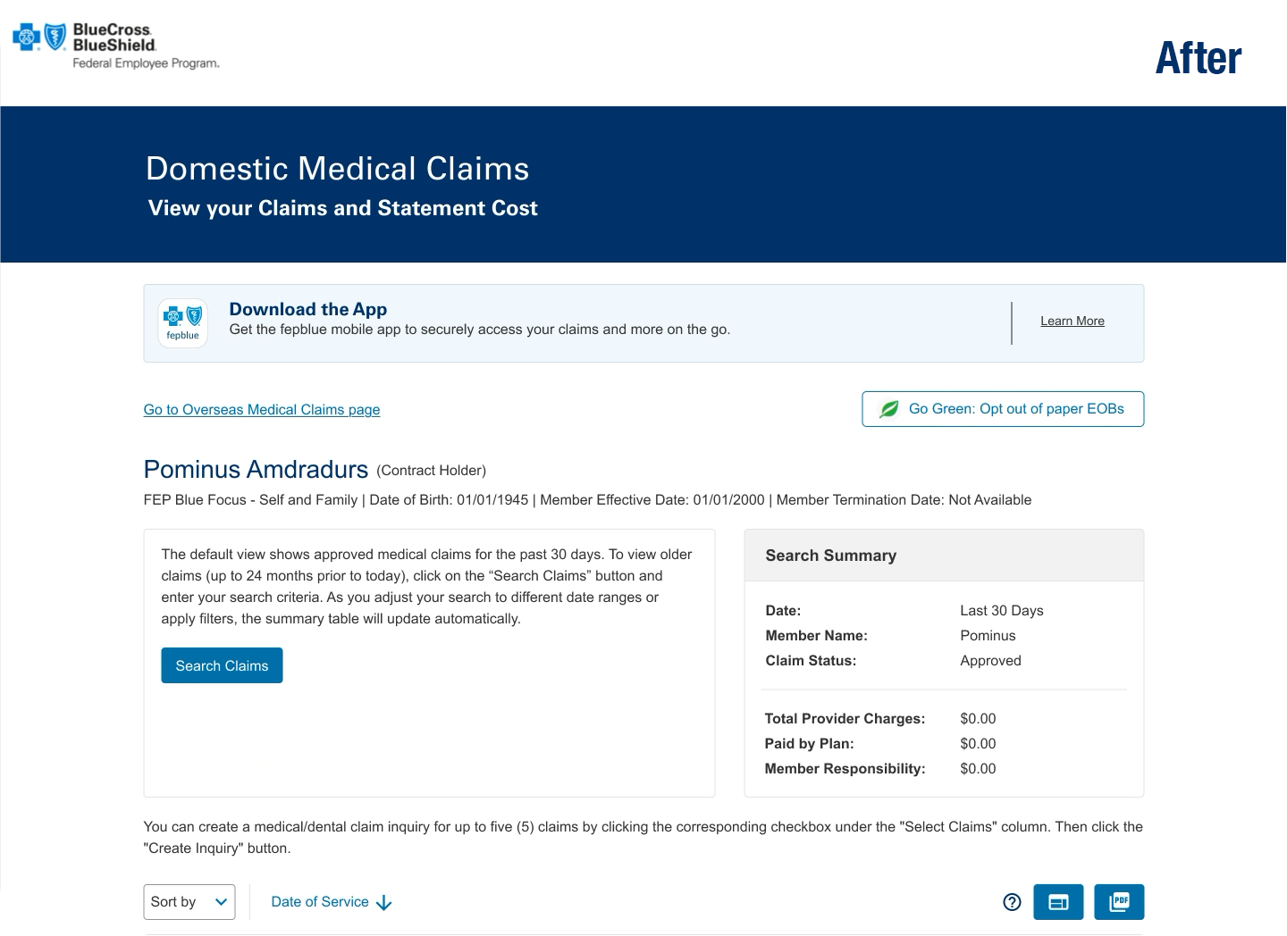
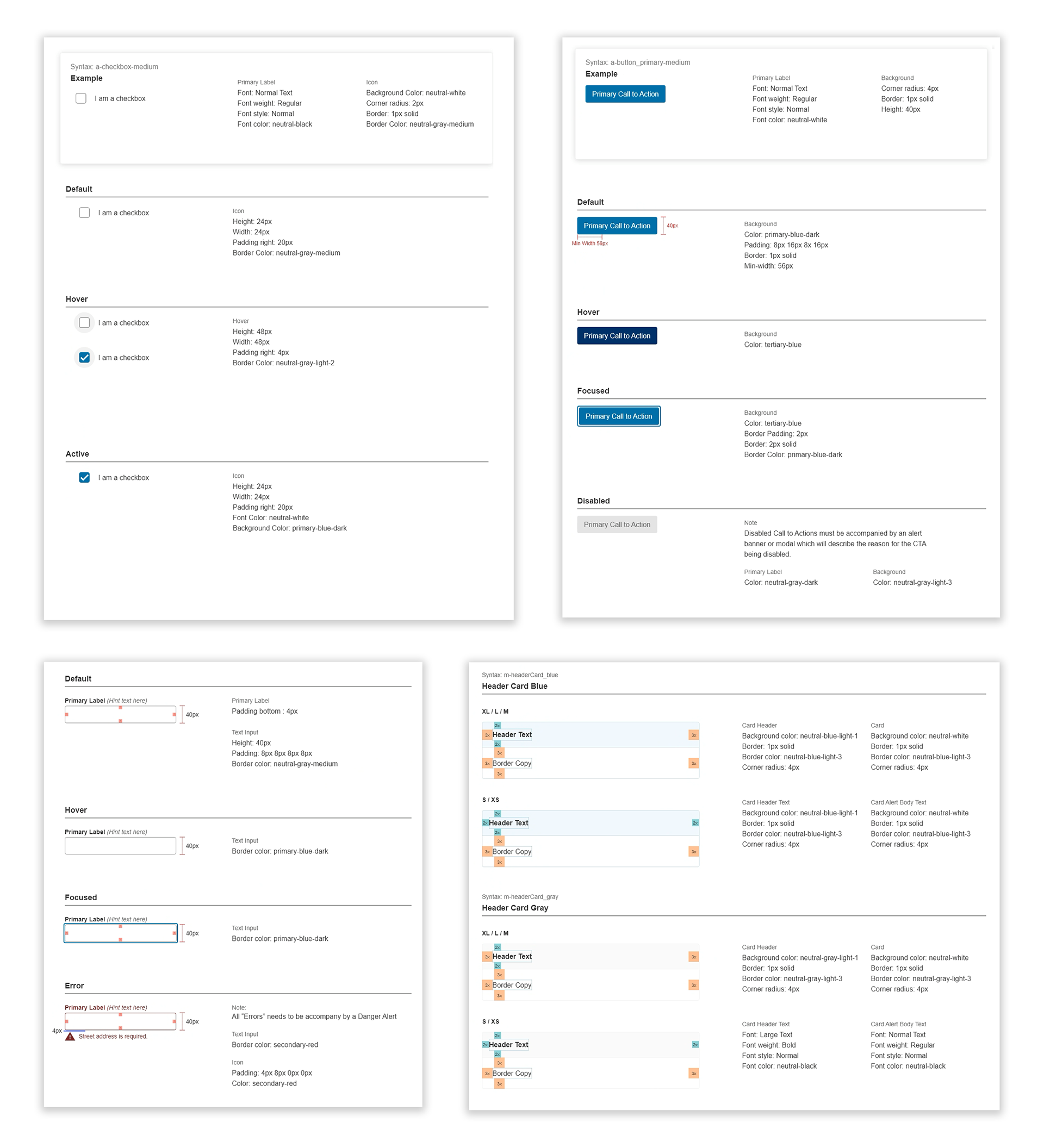
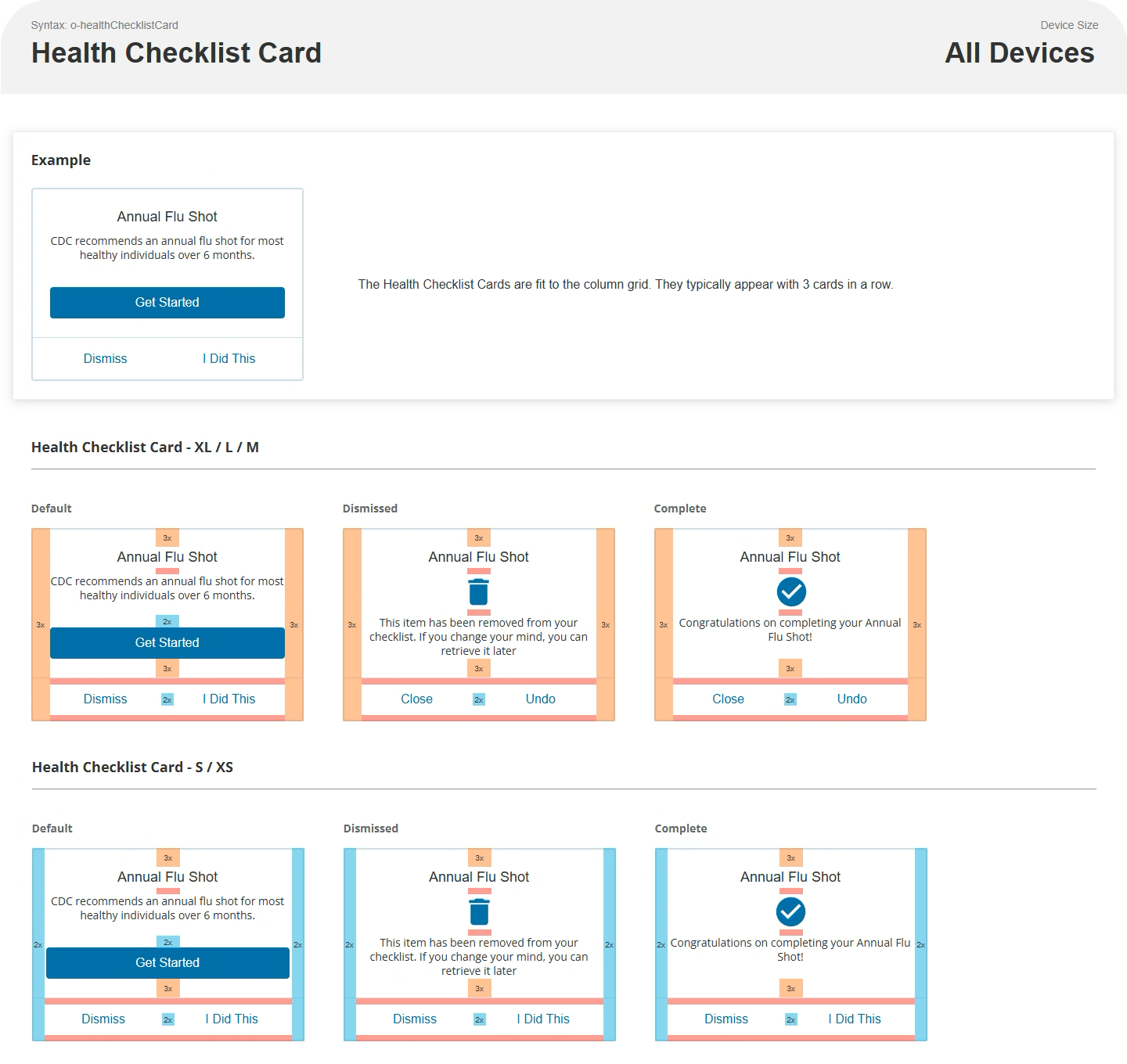
The UX Team reviewed all the eService’s 78 UI components and 30 product pages with Accessibility and Development to ensure that the components meet WCAG 2.2 guidelines.
The UX Team reviewed all the eService’s 78 UI components and 30 product pages with Accessibility and Development to ensure that the components meet WCAG 2.2 guidelines.
The UX Design Team implemented UX Methodologies and worked with UI Developers and Accessibility Team members to provide solutions to gaps in Accessibility and improve the user experience. The UX Team iterated and improved the prototypes.
The UX Team implemented our new Quality Control process with UI Developers to verify component alignment one by one and keep consistency moving forward.
Why: UX chose to work with Accessibility and the Development teams to complete the tasks to achieve the best possible outcome, based on overall quality, scalability, and flexibility. By delivering documentation and creating a guide for comparing and validating, we can save time and deliver updated pages quickly.
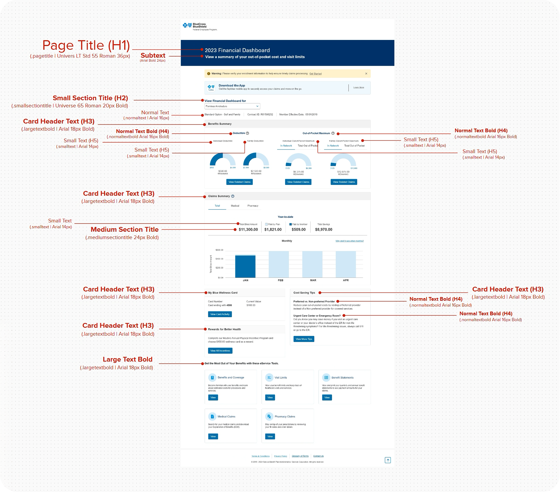
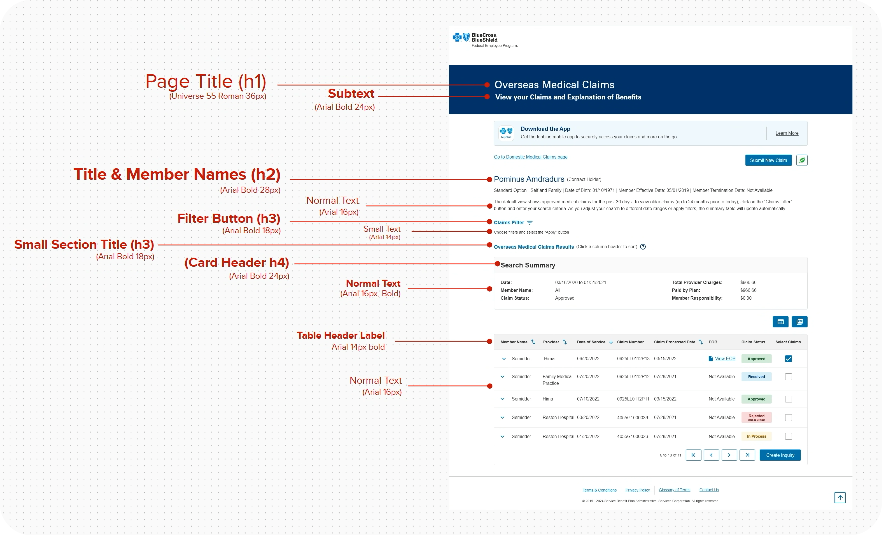
To support accessibility, consistency, and scalability across MyBlue, this component follows the MyBlue Design System’s standardized heading (H-tag) hierarchy. Heading levels are intentionally structured to reflect content importance and page flow, enabling efficient screen-reader navigation, improved content scanability, and WCAG-compliant semantic markup. This guidance was developed in collaboration with Accessibility partners to ensure reusable, system-wide alignment across personalized health experiences.
The Results
Achieved consistent alignment between UX prototypes and the W2 production environment by validating and standardizing global components across eService pages.
Improved accessibility compliance by identifying and resolving gaps early in the development and testing process.
Reduced rework and downstream defects by catching inconsistencies during component-level validation rather than post-release.
Influence
Continued refinement and implementation of UX Processes.
Reinforced adoption of the MyBlue Design System as the single source of truth for UI components and patterns.
Helped create a roadmap within the eServices products to align with the new design by establishing a repeatable validation approach that other teams could use to align legacy pages with the design system more efficiently.
Continued strengthening of relationships with the D.O. (Director’s Office) UX Designers.
What I Learned
Design system alignment is most effective when accessibility validation is embedded into the workflow, not treated as a final checkpoint.
Close collaboration between UX, Accessibility, and Engineering teams significantly improves fidelity between design intent and implementation.
Requirements from business should be brought to UX 2 sprints ahead of refinement so that UX can socialize recommendations with Accessibility first before providing to the product owners.
What to Remember
This process has provided UX with a deeper understanding of the complexity of the eService’s functionality within the codebase. And, mindful of change and iteration. By going through this process, UX has most importantly established credibility with the other cross-functional teams and the D.O. by creating a reference structure that the teams can use to make better decisions and achieve the overall objective.
This process has provided UX with a deeper understanding of the complexity of the eService’s functionality within the codebase. And, mindful of change and iteration. By going through this process, UX has most importantly established credibility with the other cross-functional teams and the D.O. by creating a reference structure that the teams can use to make better decisions and achieve the overall objective.