
A Health Screenings Dashboard to Guide Members’ Next Steps
Role: Lead Product Designer | Tools: Figma, Mural | Team: 2 UX Designers, 2 Business Analysts, 1 Product Owner | Year: 2025
The Problem
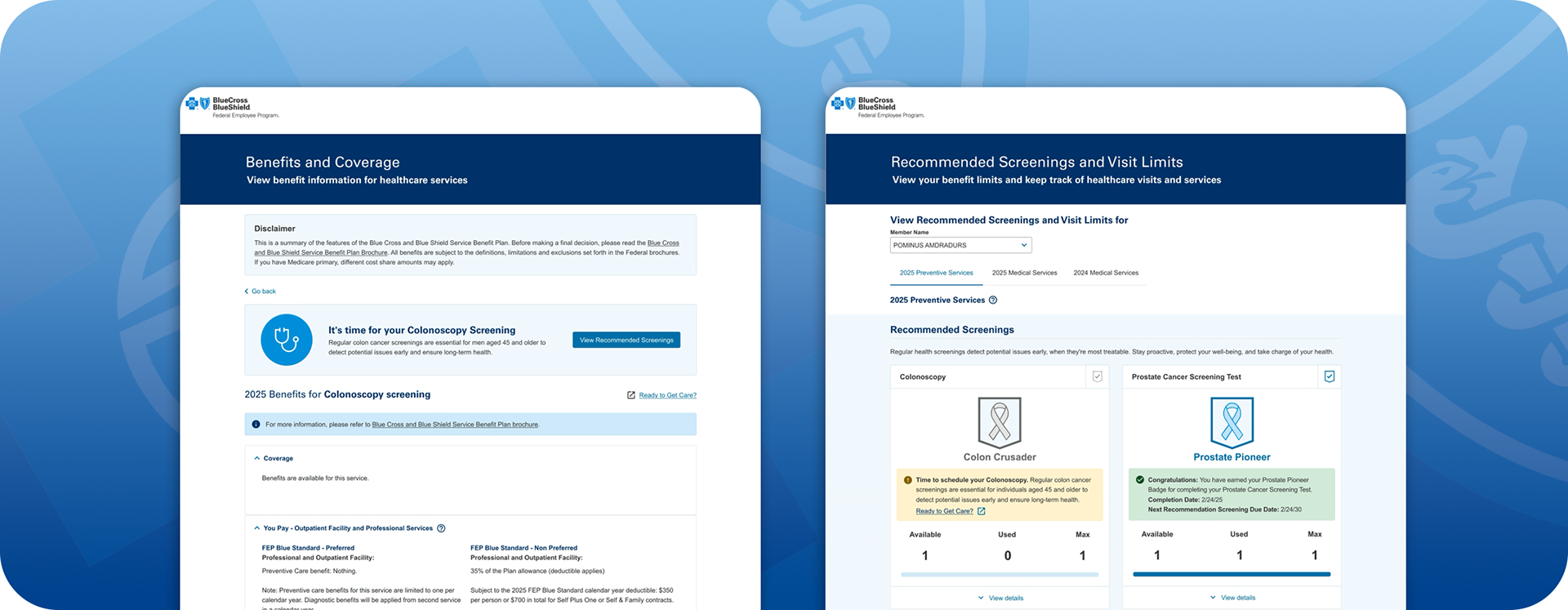
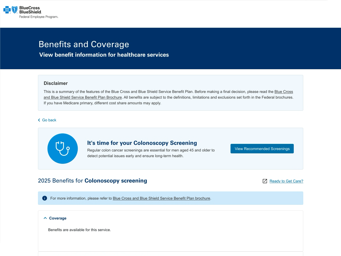
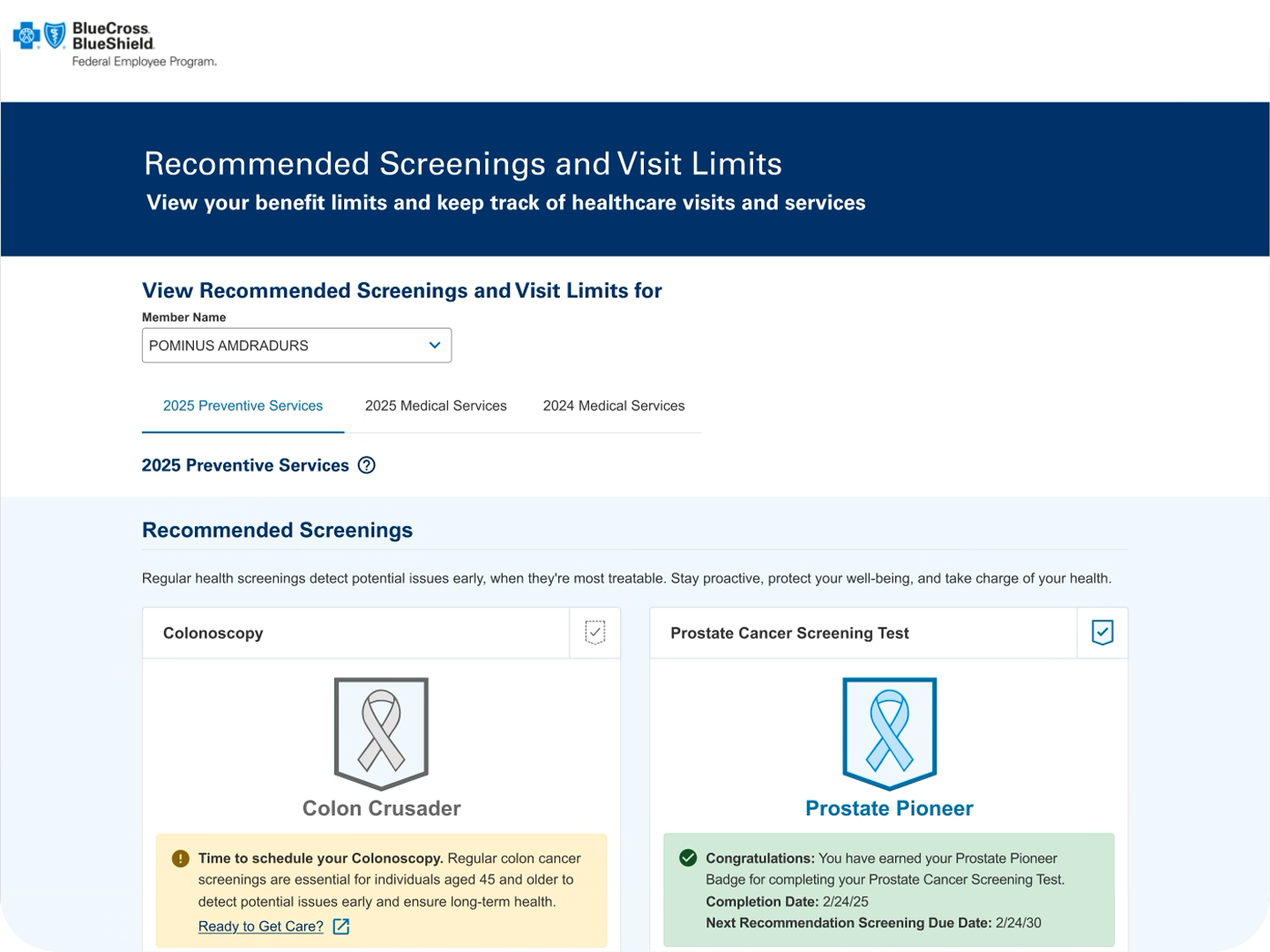
The Product Team is looking to UI/UX to collaborate on an initiative to increase engagement with Members on an improved Health Services Accumulators Visit Limits experience. Currently, the Visit Limits page is a dynamic but low-engagement feature that the Business has identified as an opportunity to increase member satisfaction with a more useful feature that assists members in improving their healthcare journey.
My Role and Approach
I worked with the team to create wireframes and an interactive high-fidelity prototype for the Business to present to Development Teams, Architecture Teams, and the Director's Office to socialize the proof of concept.
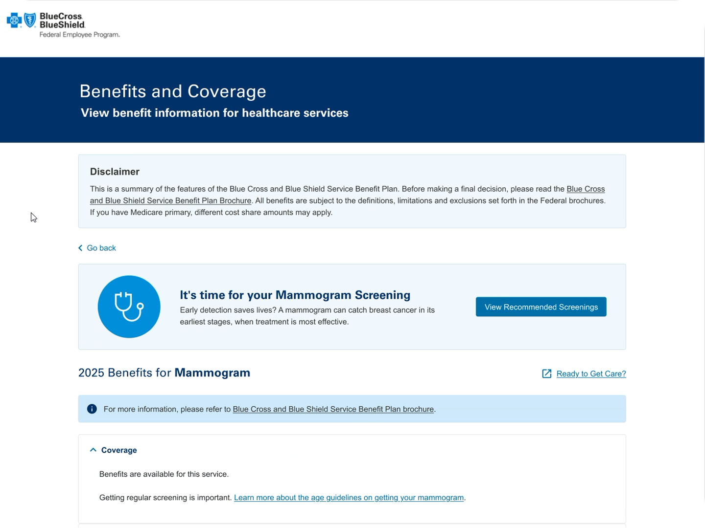
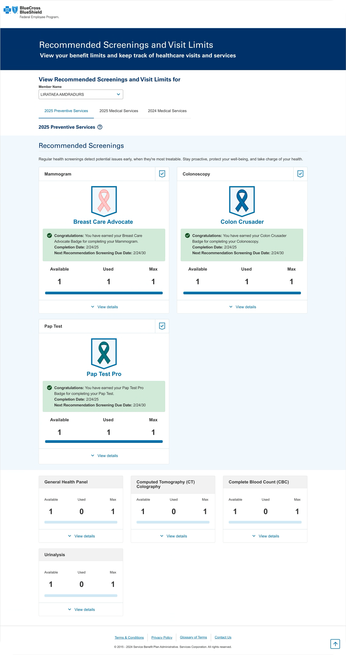
My UX team prepared several interactive high-fidelity prototypes that highlighted several Preventive Care Services. These services were identified by the Business as test cases to determine the potential viability of this concept to members to increase user engagement for this feature.
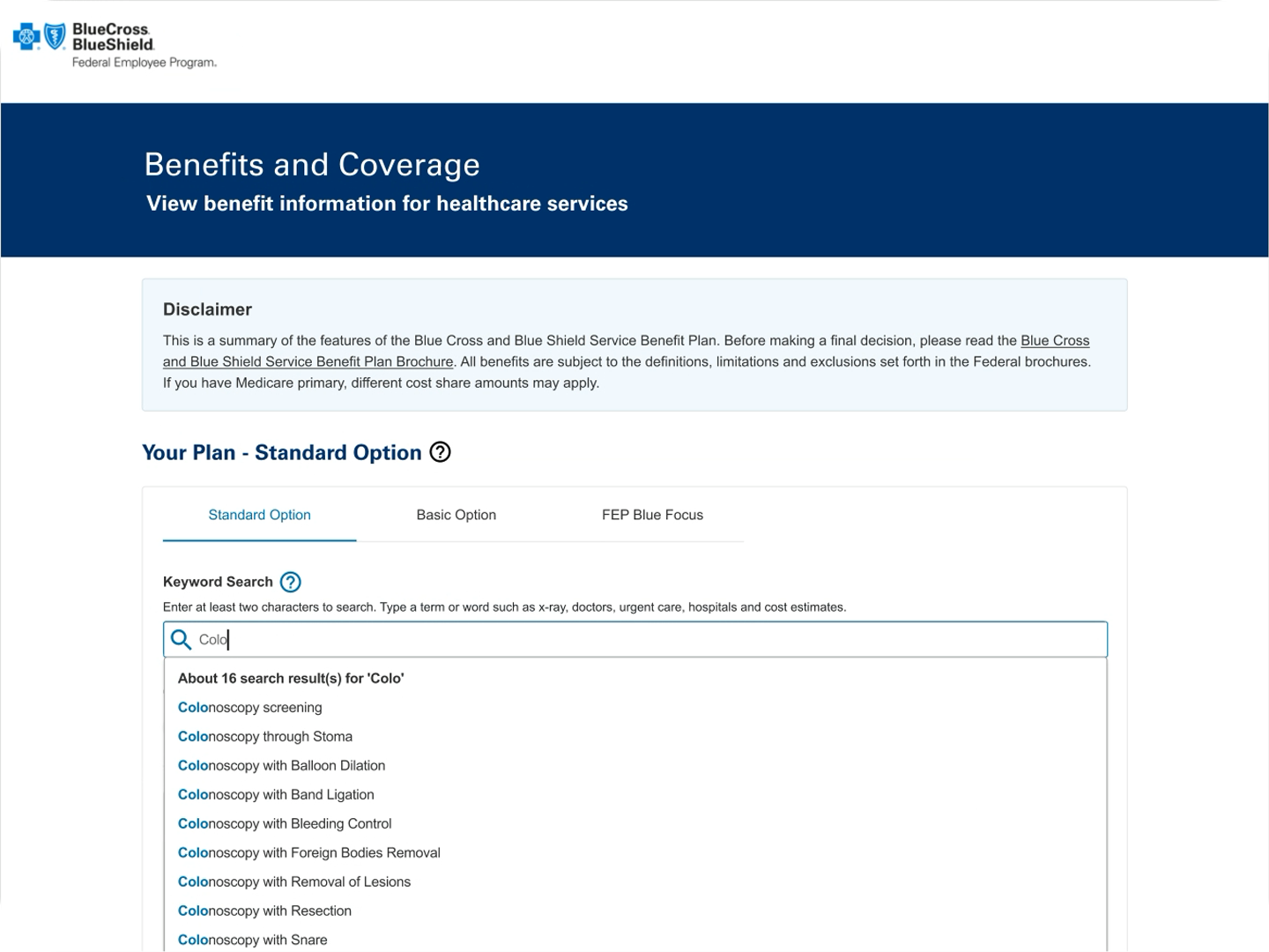
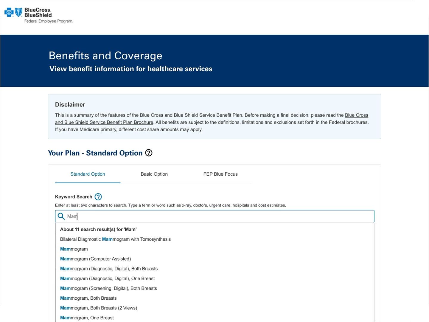
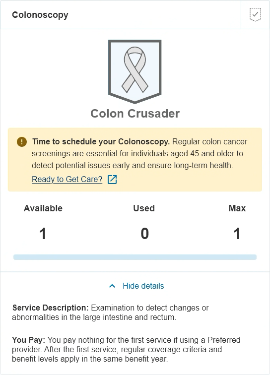
Robust Keyword Search enables users to search for benefits and coverage, including screenings such as colonoscopies and mammograms.
Action
• The UX Team researched industry standard platforms like MyChart and WebMD to identify useful examples to carry into the Personalized Dashboard Screenings feature.
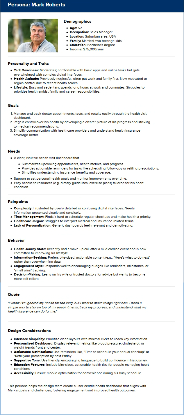
• The UX Design Team implemented UX Methodologies to Develop Personas based on the user demographics of our members. The UX Team worked with the MyBlue Team to acquire MyBlue Personas as a reference structure.
• Consumer Journey Maps.
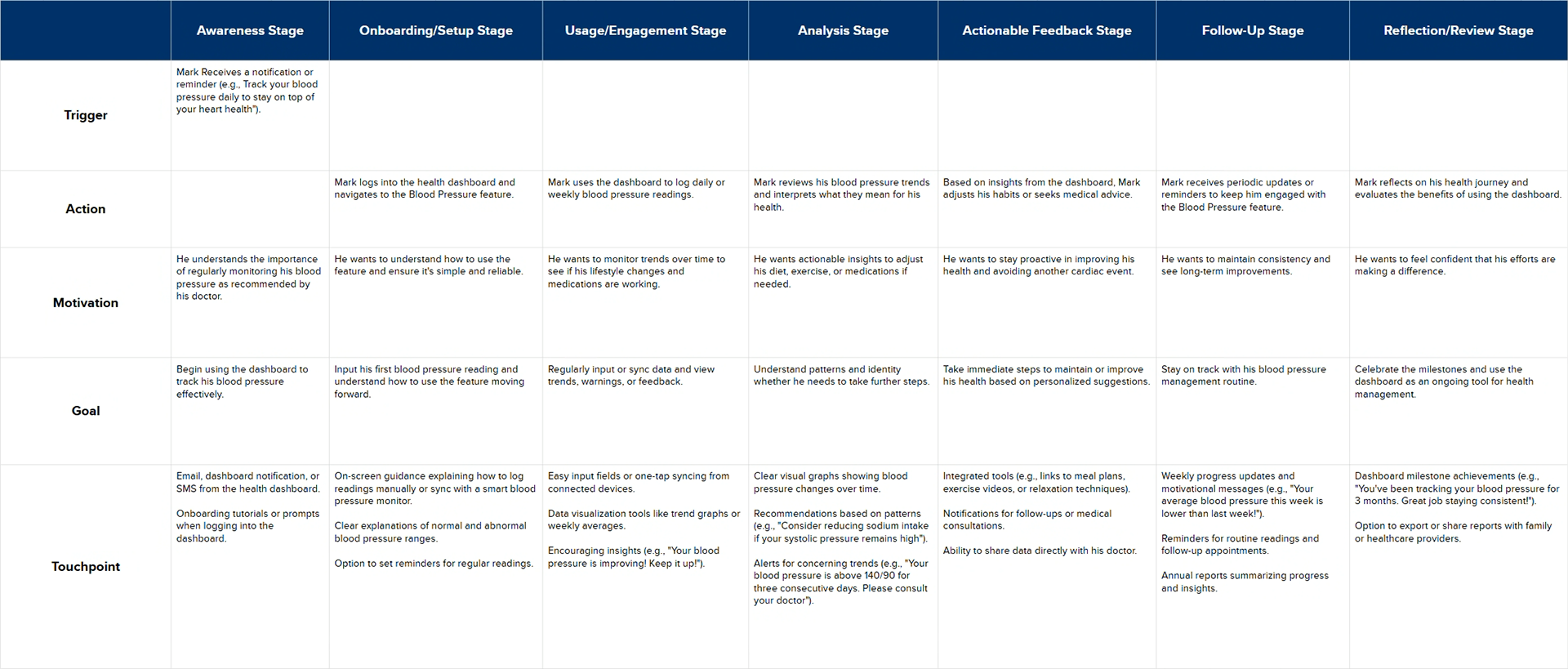
This journey emphasizes Mark's evolving relationship with the Blood Pressure feature, ensuring it supports him every step of the way with clarity, motivation, and actionable insights.
The Results
✅ The Business is moving forward on this project and will budget the production of this feature enhancement in PI4 of this year.
✅ We have a base to begin A/B testing for feedback from our users on how to best personalize experiences.
What I learned
💡 UX learned that there is some data available to be retrieved to create a more personalized experience, like the last used service, and some demographic information, like gender and age.
💡 We learned that some data is not available to be called, so the information passed back to the user may need to be more general. And scheduling is not possible from this experience currently.
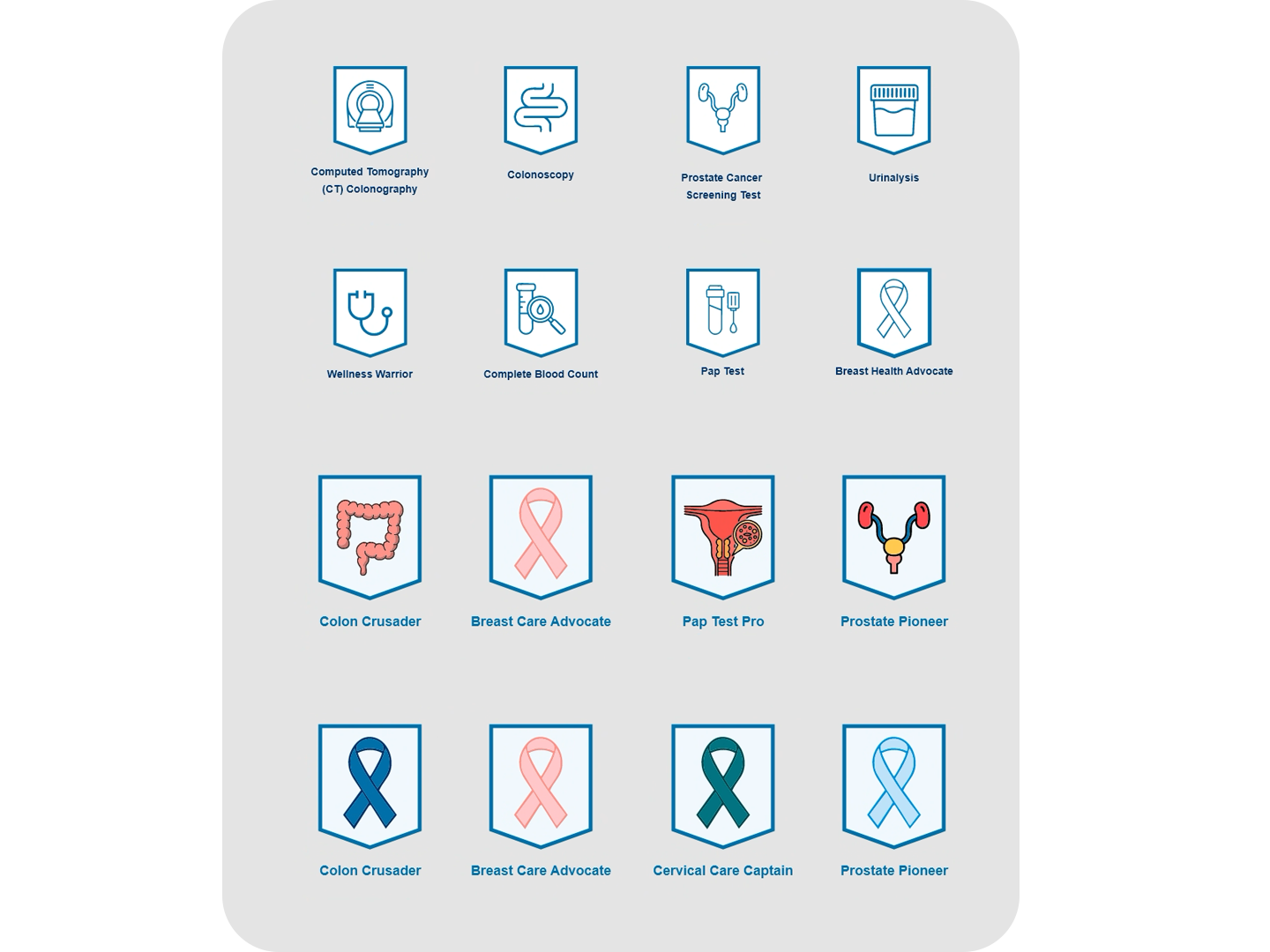
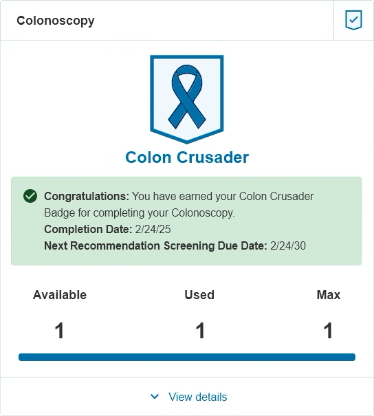
We’re testing multiple badge design variations on the Personalized Health Dashboard to understand which styles, labels, and placements drive the highest user engagement. By comparing how members notice, interact with, and act on each badge version, we can identify the most effective approach for encouraging meaningful health actions and improving overall dashboard usability.
Influence
• Incorporated the UX Process in the planning and discovery of this project.
• Continued partnership with UX and the Business, and the D.O. in the delivery of this proof of concept.
What to Remember
👉 This exercise has given UX a better understanding of what is available to product features by way of data and how to best use the data available to curate a more personalized experience for our users. By working with the Business, we continue to grow our relationship and gain trust from our partners to provide recommendations and solutions to improve our customer satisfaction.